

This year I had the incredibly good fortune of working with Virginia based Devils Backbone Brewing Company and Okay Yellow on a complete rebrand of a handful of their craft beer labels. The project afforded me the opportunity to work with a lot of great people to solve some intriguing composition challenges with illustrations which would showcase various outdoor scenes for each label.
Massive thanks to the folks at DB Brewing and the folks at Okay Yellow for the opportunity. Be sure to check out all the packaging which was art directed and designed by Dustin Artz.
I’ve been chomping at the bit to put a big process post together for this one which includes the breakdown of 5 labels as well as an art test. Without further ado, let’s dive into the world of craft brewery illustration!
The Art Test…
It’s not often I participate in art tests for projects simply because not every project I work on has a scale large enough to warrant multiple explorations from multiple illustrators. For a rebrand of a brewery which is about to take it’s beers all across the United States, however, Okay Yellow and DB Brewing wanted to make sure they found just the right look.
I was given a basic brief which would have me reimagining the Vienna Lager label, sticking close to the old label’s color palette but creating a dramatic scene with a firepit in front of rolling hills and mountains with the hint of covered patio structures in the distance.
__
Art Testing Advice: I haven’t come across a lot of helpful information pertaining to art tests so I thought I’d share a quick tip which you may or may not find helpful. While this doesn’t get into pricing (which can definitely play a factor), it does cover something I believe is very important.
If you're doing an art test, do everything you can to put 100% of your unique artistic voice into the piece. Stylize! Let the personality of your work shine! Don't try to guess what you think they want to see, simply give them the work that best represents what you're able to do and the unique way you’re able to do it.
If they go with you, it’s because your voice is the one they want. If they don't go with you, you'll know you did your best and your look simply wasn't what they were after.
__
I opted to make the fire pit the center of focus with all the hills, mountains, and tree lines rolling into the center of the composition, creating a nicely framed space in the sky for their logo to shine. I focused on keeping the palette warm and inviting and really pushed into the golden yellows and caramel colors their lager evoked.

I was truly honored to be chosen as one of the illustrators to tackle their labels. As a fan of craft beer and obvious lover of landscape illustration, the opportunity to bring these labels to life was one I didn’t take lightly. Once all the logistics were taken care of, it was time to roll up my sleeves, sharpen my pencil, and jump into Vienna Lager.
Vienna Lager

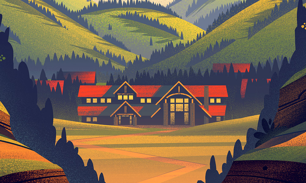
The first label we tackled was Vienna Lager. The idea behind this label was to peer into a valley where the brewing basecamp was nestled against rolling hills and mountains in the distance. Once I had a good understanding of what they were looking for, I took to sketching to find a solution.
Sketches
I wanted to utilize hills, trees, and foliage in the foreground as a framing element which would wrap around the front of the box carrier as well as the sides to create a seamless landscape. This concept of framing the logo and name of the beer would be one we’d carry through for all of the labels. You’ll also see in this first sketch where we began looking at the carrier handle itself as a place to introduce a layering of mountain peaks which would enhance the outdoor feel, especially once the beer bottles were placed in the carrier.

Color Exploration
Since this was the first label we were working on together, we spent more time exploring the color direction for Vienna Lager knowing it would set the tone and mood for the subsequent illustrations. Nailing the color on this one was crucial and it was a fun challenge looking at different options to determine which one best suited the beer itself.

In the end, the blue sky option was chosen because it helped bring home that warm summer feel without veering too far into richer yellows and browns which would be indicative of Autumn and seasonal beers. Here are a few of the detailed closeups where you can see a lot of the texture and shape work which went into every element of the illustration.


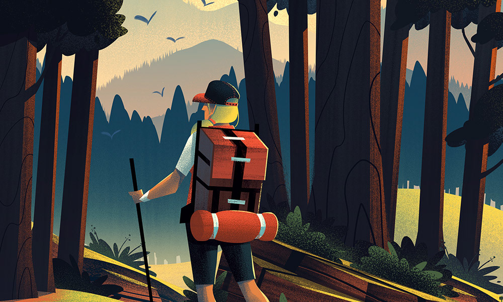
Trail Angel

The next label I worked on was a really exciting one: Trail Angel. I really fell in love with the overall concept of this piece. Essentially volunteers from DB Brewing offer to pick up Appalachian Trail hikers where Reed’s Gap intersects Blue Ridge Parkway (hence the term ‘trail angel’). With a concept like that, I was really excited to jump into sketches to see how best to visualize the narrative.
Sketches
The idea we went with was to show a hiker at the end of their journey with the welcome sight of the DB Trail Angels in a clearing ahead. I utilized lots of foliage and trees between the hiker and truck to really push the idea of the hiker venturing through the wild as she looks onto the haven ahead.
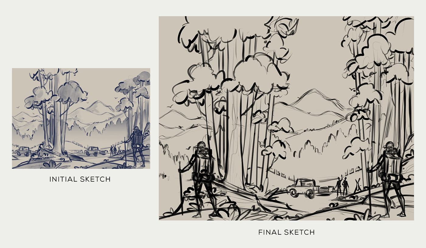
Once the sketch was approved, I began working at full resolution in black and white to establish my shapes, textures, and lighting. I really wanted to make use of shadows tracing along the hill forms between the hiker and the truck to establish strong depth in the foreground and middle ground, while the gentle hills and peaks of mountains would rise in the distance to create a dramatic scene. The duplicate hiker on the side of the illustration would appear on the side of the box (since this illustration wraps around the front and side).

Color
Once the black and white phase of the illustration was complete, I moved onto color. Coloring this piece was a lot of fun because the palette was fairly well established in Vienna Lager which meant I could explore that palette more fully here. I grouped color elements like the hiker’s backpack, truck, and Trail Angel’s shirts to thematically show they were connected. Once everything was colored, the piece really came to life. Here are a few detail shots:


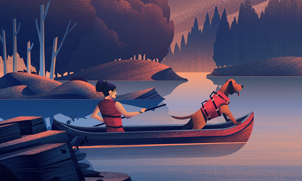
Gold Leaf

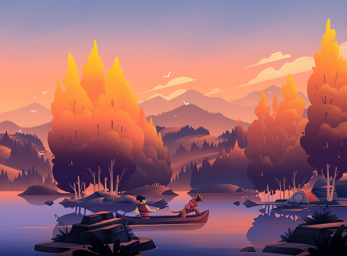
The illustration for Gold Leaf is definitely one of my favorites. The overall mood and tone of this one reminds me so much of my childhood that I’ll always have a soft spot for it.
The brief for this piece requested a beautiful lake setting being explored by a dog owner and their trusty canine companion. With a brief like that, how could I not be excited to draw!?
Sketches
The biggest challenge I had with this piece was narrowing down all the different ideas which immediately sprang to mind after I’d read the brief. I explored a handful of directions doing small thumbnail sketches and then chose 2 concepts to rough out. I sent those off for feedback and eventually we ended up with the sketch below on the right:

Color
With the sketch approved, it was time to move onto my customary black and white phase where I focused on shape, texture, and lighting. Nailing down the shape of the trees was something I spent a lot of time crafting. For me, nothing beats a well shaped tree form so I worked to sculpt the treetops and tree clusters so they’d feel just right.
__
Style Tip: The way you choose to draw a tree, a rock, a person, anything, is what helps distinguish your style of illustration. Push and pull your shapes until it looks pleasing to you… THAT is your voice coming through.
__

I was excited to add reflections in the water and as I continued painting. I imagined canoeing in water which was bathed in the golden light of the sun and with that moment in mind, I came up with this first pass at the color:

After some discussion, we added just a few touches of blue to the sky and water to really help the tips of the trees look as if they were being kissed by the sun. It was a subtle touch which brought this one home. Here are a few of the detail shots:
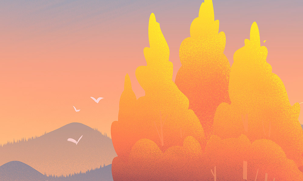


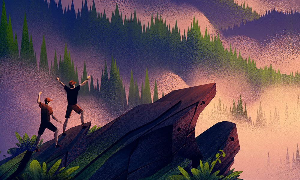
Mile 842

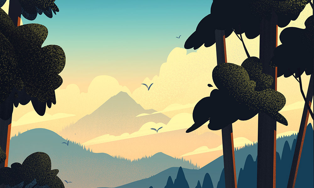
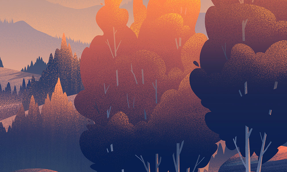
While Gold Leaf was all about serenity, Mile 842 was all about triumph. In this piece, we wanted to show hikers at the end of their journey at the famous Humpback Rock. The exhausting end of a journey, the triumph of an ending, and the setting sun in a smokey mountain range was more than enough to inspire me as I dove into the sketches.
Sketches
I knew I wanted to show rolling hills and my plan was to have them gently rising through mist which would be lit by the setting sun. The hikers would be shown celebrating after a long hike with their packs dropped behind them. I am always looking for ways of leveraging lighting as a tool to establish depth and mood so I added a few rough tones to the sketch to indicate where I was headed.

Color
When it was time to color, I knew it would be very important to get the values just right to emphasize the dramatic view before the hikers. I wanted the setting sunlight to light the mist between the rolling hills which would create a backlit backdrop for the hikers and the rocks they were standing on.

Once I chose the color palette for the sunset, the piece came together to create a unique illustration in the full set. Here are a few of the details:


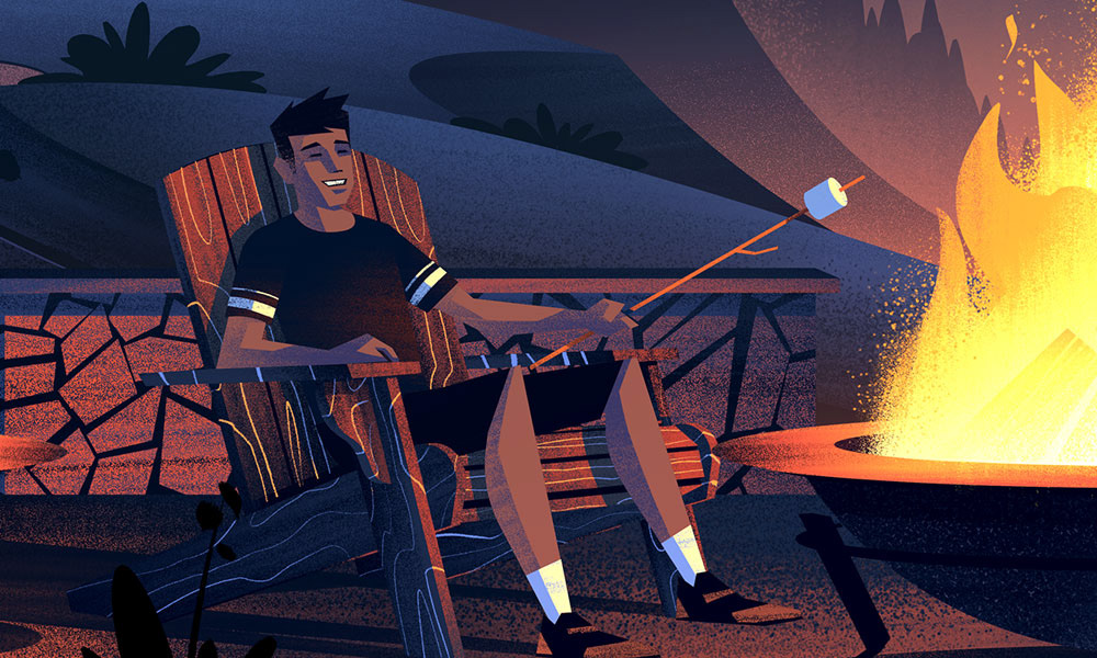
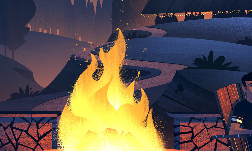
Schwartz Bier Black Lager

The very last label in the set of illustrations I worked on was for Schwartz Bier Black Lager. The concept for this piece was similar to the concept I was given for the art test, only this time we wanted to emphasize the mood of friends gathered around a firepit at night while patrons enjoy a celebration under the lighted structures in the distance.
Sketches
The composition for this piece would be similar to the composition I established during the art test (nothing goes to waste!). The biggest change would be flipping the adirondack chairs toward the viewer and showing a family enjoying a quiet moment by the fire. I still wanted to use the hill forms as a design element which would visually lead the eye into the center of the composition toward the fire. I also used the trails to trace the forms of the hills from the party structures to the quiet moment with the family.

Color
With the sketch in place, rather than working in black and white I went straight to color. I opted to do this simply because night time scenes can be easier to work with using full color - which is especially helpful in avoiding things looking overly dark. Here are some of the details:


With that, my friends, we have reached the end of my process post for a project I had a ton of fun working on this year. It’s always fun sharing the process with readers like you and it’s my sincere hope the posts are helpful in shedding some light into how these pieces are made. While I’m unable to respond to all the questions and comments, I am very thankful for all of the likes and views and hope these pieces inspire you to get out there and create!
Big thanks to everyone from DB Brewing, Okay Yellow, for everything - projects like this couldn’t happen without them!


